Settings
Your brand color
Choose one color for every page your visitors see: your public site, the daily report, shared trail pages, proposals and QR codes. The dashboard and the field app keep the same colors for every account.
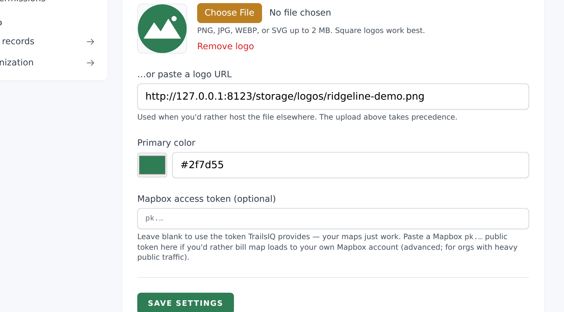
Settings → Organization details → Primary color sets one color, and TrailsIQ uses it on the pages your visitors see: your public site, a trail page you have shared, a proposal and a QR code. You choose it once, and it appears everywhere the public meets your organization.
Where it appears
- Your public site. Headers, buttons and accents on every page a visitor lands on. The website builder has its own Accent color if you want the site to look different. If you leave that blank, the site uses this color. See How to use the website builder.
- Public trail and network pages, and anything you have shared by link.
- Proposals and contracts you send to a client.
- QR codes you generate, which start on this color.
Your logo, your trail colors and your map style are all separate choices. This is the one color that runs through the pages you hand to somebody else.
Where it does not appear
In the app itself. The dashboard and the field app use the same colors for every organization, and your brand color does not change them.
We chose this on purpose. The app is a tool your crew works in, so a menu, a button and a status label look the same in every account. That makes the app easier to learn, easier to screenshot and easier to ask us about. It also means every screen in this documentation looks like the one in front of you.
Your organization's name, your logo and your public site preview still appear inside the app as they always have.
Picking one
Pick the color you already use on your signs or jerseys. There is nothing else to set, and nothing else has to match it.
Two things worth knowing before you choose:
- A color that looks good on a sign is not always easy to read as text on a white page. A mid yellow or a pale green can look right in print and fade away on a screen. If your color looks faint on your public site, try a slightly darker shade of it.
- The color is used exactly as you set it. TrailsIQ does not adjust it, so what you see in the picker is what a visitor sees.
You can change it whenever you like. Your public pages update straight away, and there is nothing to republish.